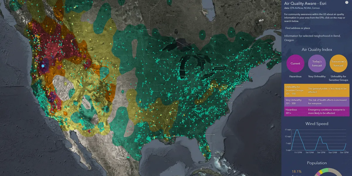
Mapping company Esri has launched an app to help users understand the impact of air pollution in US communities.
Esri environment content lead Dan Pisut says the Air Quality Aware app helps users understand air quality information provided by the US Environmental Protection Agency's (EPA) AirNow Programme.
AirNow consolidated air quality constituents like PM 2.5 (small particles) and PM 10 (larger particles) into air quality indexes (AQI).
“Using official EPA data available in ArcGIS Online and Living Atlas of the World, Air Quality Aware merges this and other contextual information like wind forecasts and at-risk population demographics to answer some fundamental questions,” Pisut adds.
ArcGIS Online is part of the Esri Geospatial Cloud. It allows users to connect people, locations and data using interactive maps while also offering analysis tools which deliver location intelligence, the firm says.
Living Atlas of the World is a collection of geographic information which includes global maps, apps and data layers.
According to Pisut, there are nearly 3,000 air quality sensors deployed around the US, allowing app users to see near real-time index and concentration values for PM 2.4 and PM 10 in nearby areas.
“Click on any location in the map (or search) and three circles will appear: the AQI now, the forecast for later today and the forecast for tomorrow,” he explains.
Research from the Centers for Disease Control and Prevention has identified people with asthma or other cardiovascular conditions as one of several groups of people most at risk from air quality impacts.
Other groups of people most at risk include the elderly, people living in poverty and those working outdoors.
“Using the latest data from the American Community Survey, we have included several demographic summaries at the Census tract level (neighbourhoods) to help identify areas with at-risk populations,” Pisut reveals.
The US Census Bureau conducts the survey to help determine how more than $675 billion in federal and state funds are distributed each year. Information on topics such as jobs, veterans and homes are used by public officials and planners to plan the future.
The app includes a chart which breaks down the demographic components of a neighbourhood such as the percentage of elderly, school children and those suffering from asthma.
For example, searching Mariposa, California, reveals elderly people make up 28.7% of the 3,907 people living in the neighbourhood.
The chart shows this percentage of elderly people is higher than the national average, which runs at 16.6%.
Despite this, other at-risk populations reveal an opposite trend as school children make up 11.9% (national average 16%) while those suffering from asthma amount to 3.2% (national average 7.7%).
Additionally, Esri's app uses the National Oceanic and Atmospheric Administration (NOAA) National Weather Service’s 72-hour wind forecast to provide hourly forecasts for wind speed.
“While winds may make fires, smoke, and air quality worse, usually they help clear the skies,” Pisut concludes.